My brief ownership of Lightwave 3D, first on the Amiga and later on a 486, proved disastrous. While the quality of the animation was “okay”, the overuse of textures and lens flares was inexcusable. That, and I simply didn’t have the patience or the addiction to snack foods required for long computer visits. I liken the animation to a kid who had a new car all tricked out, going so far as to add Yosemite Sam mudflaps on a Hyundai Excel. This is a metaphor, of course. I’d never own a car that is also a spreadsheet program.
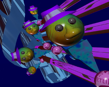
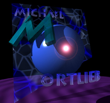
In order: a Blues Note thing with an animated character I created, and then a really crappy logo for my very first self-promotional website, and then an intro for a never-built Director presentation for my first employer in Seattle.
Blues Note Series (still image and short animation)

Logo Treatment for original self-promo site

Documents International introduction
For a never-made CD-ROM(!) project, complete with rotate, spin and lens flare.
