Great read about the design approach for the logo.

Also in design: The Pomegranate Phone.

Mortie, Mortie: He's no shorty, Mortie.
Cendant CEO and Starbucks employee to wed(!).
Poverty, Pension Fears Drive Japan’s Elderly Citizens to Crime.
Obese have right to two airline seats, in Canada.
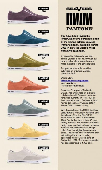
Shoes for graphic designers, in certified PANTONE color. (pantone/seavees0963)

Great idea. But for God’s sake, if you’re going to show a really cool concept car, don’t make the production model look like this.
Nicely designed merit badges with political intent, and drinks inspired by Mad Men.
From the BBC’s Britain From Above series, air, ship and data/phone traffic animated from above the UK.
The New York Times weighs in on the iPhone’s success, and design usability hero Edward Tufte gets a prominent mention.
In a recent article and accompanying video posted on his Web site, Edward Tufte, the information and visualization designer at Yale, argues that the iPhone’s success is attributable in part to the decision by iPhone designers to dispense with clutter — all of the irritating buttons and menus that are part and parcel of a typical computer interface.
“The content is the interface, the information is the interface, not the computer administration debris,” he said in a video critique of the iPhone.
He also notes that the iPhone succeeds by “intensifying” information, made possible in part by its higher resolution display and in part by packing more useful information in each display.
Microsoft’s products could use this approach. Honestly, we might use about a tenth of those grouped icon bars. To be fair, they’ve improved the clutter somewhat on Office 2008 for the Mac, but it’s only a faint start. Hopefully, the next (last?) version of Office is truly a Mac application.
Photoshop creations of unpopular movie-based video games, everything you wanted to know about custom typeface designers, and this rather brilliant idea of portable water purification:
LifeStraw® water purifiers have been developed as a practical way of preventing disease and saving lives, as well as achieving the Millennium Development Goal of reducing by one-half the proportion of people without sustainable access to safe water by the year 2015.
if you can render Homer Simpson in CSS. No graphics are used here, and that’s pretty amazing.
In one handy place!
And one of the best blogs I’ve read in a long time, it’s Stuff White People Like.
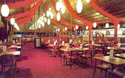
Denny’s isn’t worth saving, but Mannings Cafeteria should be preserved — lovely shot from the Ballard News Tribune.

And an architect in the P-I shows how the developers can merge both old and new.
Artist’s sketch to save Denny’s, the Sunset Bowl, and add some condos! from hugeasscity.